

Trong cuộc sống hàng ngày, đã bao giờ bạn rơi vào tình thế lúng túng khi phải giao tiếp bằng tiếng Anh chưa? Dưới đây là hơn 100 cấu trúc tiếng Anh giao tiếp thông dụng nhất trong các tình huống giao tiếp thường ngày, được chia thành các chủ đề khác nhau. Nếu muốn nâng cao khả năng giao tiếp của mình, bạn hãy tham khảo ngay nhé! 1. Các mẫu câu tiếng Anh giao tiếp dùng khi chào hỏi Cấu trúc Ý nghĩa ... Xem chi tiết
Main Content
Học tiếng Anh

100+ CÂU TIẾNG ANH GIAO TIẾP HÀNG NGÀY THÔNG DỤNG NHẤT
Trong cuộc sống hàng ngày, đã bao giờ bạn rơi vào tình thế lúng túng khi phải giao tiếp bằng tiếng Anh chưa? Dưới đây là hơn 100 cấu trúc tiếng Anh giao tiếp thông dụng nhất trong các tình huống giao tiếp ... Xem chi tiết
Trắc nghiệm tiếng Anh 11 Unit 1 A long and healthy life Trắc nghiệm tiếng Anh 11 – Global Success
Bài tập trắc nghiệm tiếng Anh 11 Unit 1: A long and healthy life là tài liệu vô cùng hữu ích, giúp học sinh lớp 11 củng cố bài tập sau các bài học trên lớp sách Global Success 11.Trắc nghiệm tiếng Anh 11 unit 1 ... Xem chi tiết

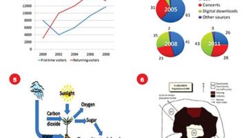
Bí quyết xử lý gọn tất cả các bài thi nghe tiếng Anh
Để đạt được các chứng chỉ quốc tế, hoặc các tấm bằng tiếng Anh phù hợp cho công việc, bạn luôn phải tham gia các kì thi nghe tiếng Anh, trong đó có TOEIC và IELTS. Nhiều bạn luôn lo lắng liệu khả năng nghe hạn ... Xem chi tiết
(no title)
Tổng hợp Ngữ pháp Tiếng Anh lớp 8 cực hay, chi tiết Tài liệu Tổng hợp Ngữ pháp Tiếng Anh lớp 8 cực hay, chi tiết trình bày khái quát lại ngữ pháp, các dạng bài tập cũng như các đề thi Tiếng Anh tự luyện nhằm ... Xem chi tiết
121 bài tập Tiếng Anh 6 thí điểm
Minh Phạm minhphamblog@gmail.com | 2015 121 BÀI TẬP TIẾNG ANH 6 THÍ ĐIỂM o Phonetics o Vocabulary o Grammar o Reading www.minh-pham.info Bài tập Tiếng Anh 6 Thí điểm | 1 Table of Contents UNIT 1: MY NEW SCHOOL ... Xem chi tiết

Tổng hợp từ vựng tiếng Anh bắt đầu bằng chữ m thông dụng bạn cần biết
Có nhiều cách để người học tiếp cận và học từ vựng tiếng Anh khám phá những từ vựng mới. Bạn có thể học từ vựng theo chủ đề. Cũng có thể học từ vựng theo bảng chữ cái. Cùng tìm hiểu và khám phá từ vựng tiếng ... Xem chi tiết
Luyện thi Ielts
Cách viết IELTS writing task 1 Từ A – Z cho người bắt đầu
Bạn là người đang muốn tự học IELTS writing task 1 tại nhà, tuy nhiên bạn không biết nên bắt đầu từ đâu và học như thế nào? Trong bài viết này IELTS Fighter sẽ hướng dẫn chi tiết cách viết IELTS wrting task 1 ... Xem chi tiết
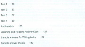
Download Cambridge IELTS 11 book (PDF version + audio)
🔎 Nội dung sơ lược Cambridge IELTS 11Cambridge IELTS 11 nằm trong bộ sách cùng tên, được phát hành bởi nhà xuất bản Cambridge University Press - một trong những nhà xuất bản uy tín nhất trong giới học thuật ... Xem chi tiết
Những tài liệu luyện thi IELTS cấp tốc không thể bỏ qua
Học IELTS cấp tốc có được không? Câu trả lời là có. Nhưng bạn cần dành nhiều thời gian để học tập và cày cuốc. Để phụ trợ cho quá trình ôn tập của bạn, tài liệu rất quan trọng. IELTS Fighter chia sẻ các bạn ... Xem chi tiết

5 trung tâm học luyện thi IELTS tốt nhất Hà Nội bạn nên tham khảo!
Nhu cầu học luyện thi IELTS tại Việt Nam có xu hướng tăng mạnh trong khoảng thời gian những năm gần đây. Đi kèm với nhu cầu học viên, rất nhiều trung tâm IELTS Hà Nội “mọc lên như nấm”. Vậy nên, nhiều bạn vẫn ... Xem chi tiết
IELTS Reading Practice Test 71 with Answers
READING PASSAGE 1 You should spend about 20 minutes on Questions 1-14 which are based on Reading Passage 1 below. Gender selection-the choosing of a baby’s gender prior to birth-occurs in many parts of the ... Xem chi tiết

IELTS là gì? Những thông tin ít ai biết về bài thi IELTS 2023
Đã từ lâu nay chứng chỉ tiếng Anh IELTS là một phần không thể thiếu khi nộp hồ sơ đi du học đồng thời cũng là loại giấy tờ nhiều công ty có yếu tố nước ngoài yêu cầu nhân viên của mình phải sở hữu. Thế nhưng ... Xem chi tiết
Học tiếng Nhật
LỚP GIAO TIẾP TIẾNG NHẬT CHẤT LƯỢNG CAO
LỚP HỌC TIẾNG NHẬT GIAO TIẾP CHẤT LƯỢNG CAO (100% nghe nói) Tiếng Nhật và giao tiếp tiếng Nhật trong cuộc sống hàng ngày và công việc tại Việt Nam ngày nay cũng rất quan quan trọng như tiếng Anh. Lý do là quan ... Xem chi tiết
TỪ VỰNG TIẾNG NHẬT ĐỒ DÙNG TRONG NHÀ
Trong tiếng Nhật, hai phần được cho là khó nhất chính là kanji và ngữ pháp, tuy nhiên không thể vì vậy mà lại bỏ qua từ vựng được. Nếu không có chút kiến thức nào về từ vựng nào thì bạn hoàn toàn không thể hiểu ... Xem chi tiết
LỚP GIAO TIẾP TIẾNG NHẬT CHẤT LƯỢNG CAO
LỚP HỌC TIẾNG NHẬT GIAO TIẾP CHẤT LƯỢNG CAO (100% nghe nói) Tiếng Nhật và giao tiếp tiếng Nhật trong cuộc sống hàng ngày và công việc tại Việt Nam ngày nay cũng rất quan quan trọng như tiếng Anh. Lý do là quan ... Xem chi tiết
Tuyển sinh giảng viên cơ hữu tiếng Nhật| Đại học Đông Đô
Trường đại học Đông Đô có trụ sở chính tọa lạc trên 4ha tại Phú Nghĩa - Hà Nội và các chi nhánh trực thuộc, với 20 năm thành lập và phát triển, đã đào tạo hơn 40.000 sinh viên trong các lĩnh vực, cung cấp cho ... Xem chi tiết
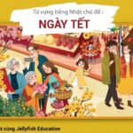
Từ vựng tiếng Nhật ngày Tết
“Tết Tết Tết Tết đến rồi Tết đến trong tim mọi người…” Tết nhà các bạn về đến đâu rồi? Tết đã về tới tim của từng thành viên Jellfyfish Education chúng mình rồi đấy. Nhân dịp Tết này, hãy cùng chúng mình học ... Xem chi tiết

21+ Website Học Tiếng Nhật Online Miễn Phí, Tốt Nhất Hiện Nay
Website học tiếng Nhật miễn phí tốt nhất là những trang nào? Ở bài viết này của trung tâm Nhật ngữ Ngoại Ngữ You Can chúng tôi sẽ cung cấp cho bạn 21+ địa chỉ web học online từ vựng, ngữ pháp JLPT, giao tiếp ... Xem chi tiết
Katakana P1 – Hàng A, Ka
Chúng ta đã hoàn thành bảng chữ cái tiếng Nhật đầu tiên - Hiragana rồi. Tiếp theo hãy cùng GoJapan tìm hiểu tiếp đến 2 hàng đầu tiên của bảng tiếp theo, bảng Katakana hay còn gọi là bảng chữ cứng nhé! Để dễ hơn ... Xem chi tiết

LingoDeer Học tiếng Anh, Hàn, Trung, Nhật miễn phí
Học ngoại ngữ hiệu quả và thông minh hơn cùng LingoDeer. Đây là phiên bản LingoDeer Free trên trình duyệt, cho phép học tiếng Anh, Trung, Hàn, Nhật… trên máy tính và các thiết bị di động mà không cần cài ... Xem chi tiết
